
Creating Cohesion: The Art of Color Coordination in Your First Home
- Phasezero Design Studio
- Jan 16
- 2 min read

Updated: May 17
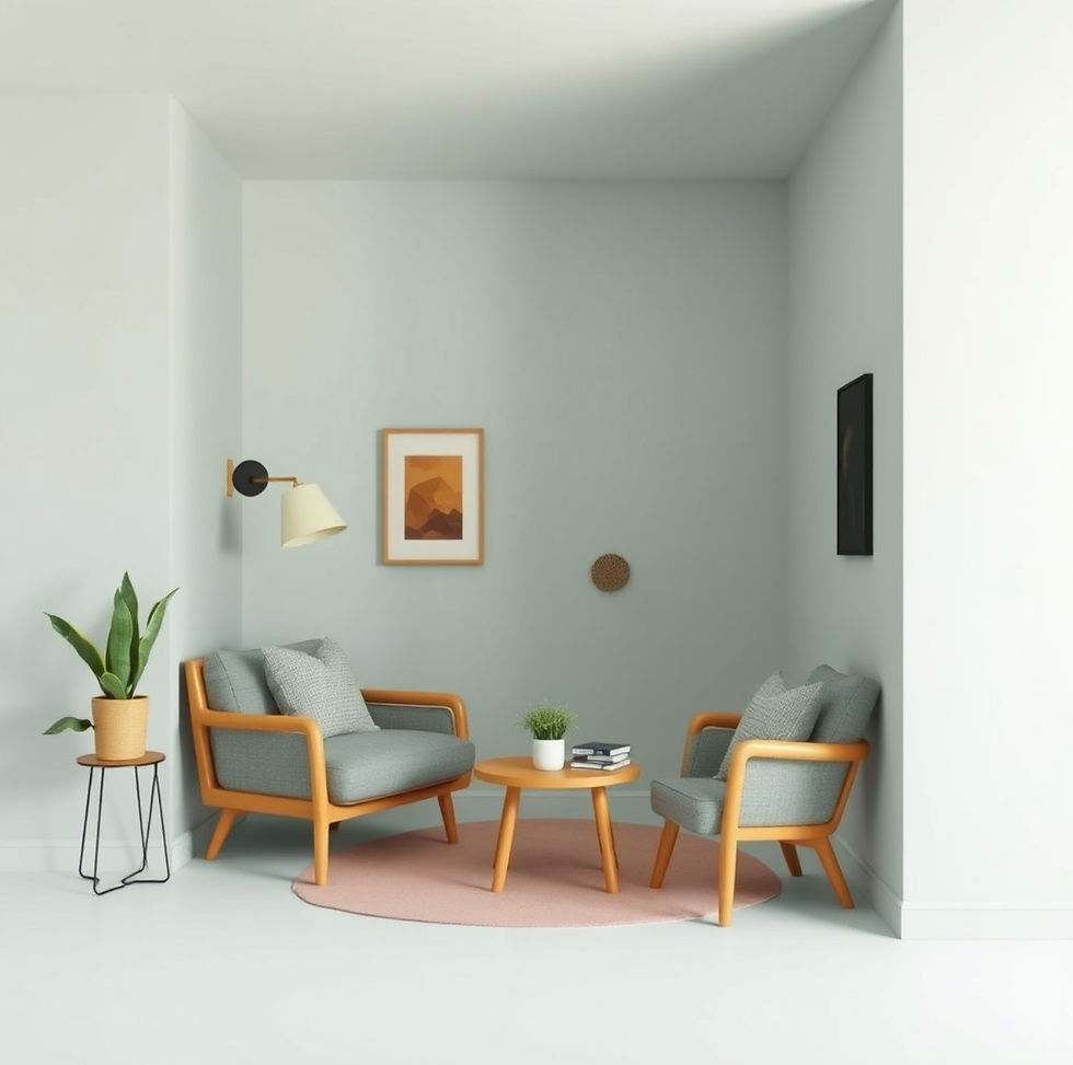
Color is one of the most powerful tools in interior design—capable of shaping mood, defining space, and creating a sense of belonging. For first-time homeowners, mastering color coordination is less about following trends and more about building a cohesive foundation that will grow beautifully over time.

Thoughtful color choices turn a collection of rooms into a unified home.
Why Color Cohesion Matters
Without coordination, even well-furnished spaces can feel fragmented. A cohesive color strategy ensures visual continuity, emotional comfort, and architectural clarity. It allows each room to have its own identity while still feeling connected to the whole. Cohesion doesn't mean sameness—it means harmony.
Start with a Core Palette
Begin with three to five core colors that reflect your lifestyle and personality. These typically include a dominant neutral, one or two supporting tones, and one or two accent shades. This palette becomes the thread that runs through every space, applied in varying proportions.
Let Neutrals Build the Base
Soft whites, warm greys, taupes, and muted beiges provide flexibility and longevity. They allow furniture, art, and textures to stand out while maintaining visual calm. Neutrals also adapt easily as your style evolves.
Use Accent Colors with Intention
Accent colors bring character and energy. Instead of spreading them randomly, repeat them strategically through cushions and textiles, artwork and décor, small furniture pieces, and feature walls or joinery details. Repetition creates rhythm and reinforces cohesion.
Balance Warm and Cool Tones
A harmonious home blends warm and cool undertones. Too much warmth can feel heavy; too much coolness can feel sterile. Balanced layering creates visual depth and comfort. Texture plays a key role here—wood, fabric, metal, and stone naturally help regulate tonal temperature.
Consider Light Before Choosing Color
Natural and artificial lighting dramatically influence how color is perceived. Always test samples in different times of day. A shade that feels perfect in a showroom may behave very differently in your home. Light reveals the true character of color.
Final Thoughts
Color coordination is not about perfection—it's about intention. When colors are chosen with clarity and consistency, they create emotional comfort, visual flow, and a strong sense of identity. For first-time homeowners, a cohesive color story lays the foundation for a home that feels calm, confident, and unmistakably yours. Because true design harmony begins with thoughtful color.


Comments