Sensory-Friendly Lighting And Colour Palettes In Interior Design
- Phase Zero
- Nov 14, 2025
- 2 min read
Creating Calm Spaces: The Science Behind Sensory-Friendly Lighting and Colour in Interior Design
In recent years, the interior design industry has undergone a significant shift towards inclusivity and accessibility. One of the most impactful areas of this transformation is the thoughtful application of lighting and colour—elements that profoundly affect how neurodivergent individuals experience their environments. Whether designing for someone with autism, ADHD, or sensory processing differences, understanding the science behind lighting and colour choices can transform a space from overwhelming to genuinely restorative.
The Problem with Conventional Lighting
Traditional interior design often relies on bright, fluorescent, or harsh lighting that can trigger sensory overload in neurodivergent individuals. Flickering lights, high colour temperatures, and excessive brightness can cause discomfort, anxiety, and difficulty concentrating. For people with autism or ADHD, these lighting conditions may exacerbate symptoms and create an environment that feels hostile rather than welcoming.

Adaptive Lighting Solutions
The foundation of sensory-friendly design begins with adaptive lighting. Dimmable lights allow occupants to control brightness levels according to their needs, while warm colour temperatures (2700K-3000K) create a calming atmosphere compared to cool, clinical lighting. LED technology has revolutionised this space, offering flicker-free options that eliminate the subtle strobing effect of older bulbs—a common trigger for sensory discomfort.
Natural light remains invaluable, but it should be managed thoughtfully. Blackout curtains, sheer blinds, and strategic window placement allow individuals to regulate glare and control their light exposure throughout the day, supporting natural circadian rhythms while preventing overstimulation.
Colour Psychology and Neurodiversity
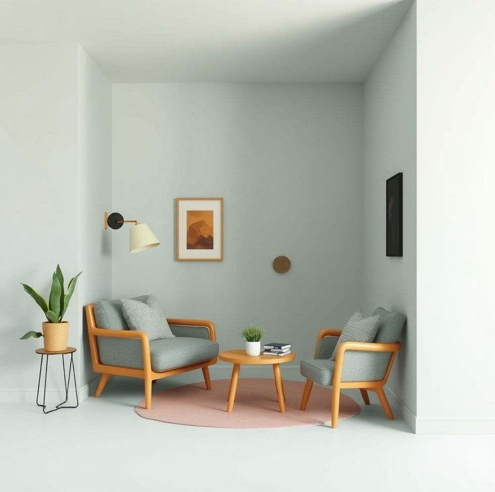
Colour selection plays an equally crucial role in creating neurodivergent-friendly spaces. Research suggests that muted, neutral palettes—soft greys, warm beiges, gentle greens, and soft blues—promote calm and reduce visual overwhelm. These colours provide a stable visual foundation that doesn't compete for attention or create jarring contrasts.
However, colour preferences vary significantly among individuals. Some neurodivergent people find certain colours deeply soothing, while others may experience them as triggering. This is where the principle of "neuroflexibility" becomes essential: designing spaces that offer choice and personalisation allows individuals to adapt their environment to their unique sensory profile.

Practical Implementation
For interior designers working with neurodivergent clients or creating inclusive spaces, consider these evidence-based strategies:
Install dimmable, warm-toned LED lighting throughout the space
Use matte finishes on walls and surfaces to reduce glare and reflections
Incorporate accent colours sparingly and in soft, desaturated tones
Provide layered lighting options (ambient, task, and accent lighting) for flexibility
Test colour choices with clients before full implementation
Consider the interaction between artificial and natural light throughout the day
Conclusion
Sensory-friendly lighting and colour design isn't merely an aesthetic choice—it's a fundamental aspect of creating spaces where neurodivergent individuals can thrive. By prioritising adaptive lighting, warm colour temperatures, and thoughtful colour palettes, designers can craft environments that support well-being, reduce anxiety, and foster a genuine sense of belonging. As the design industry continues to embrace neurodiversity, these principles will become increasingly central to what we consider "good design."


Comments